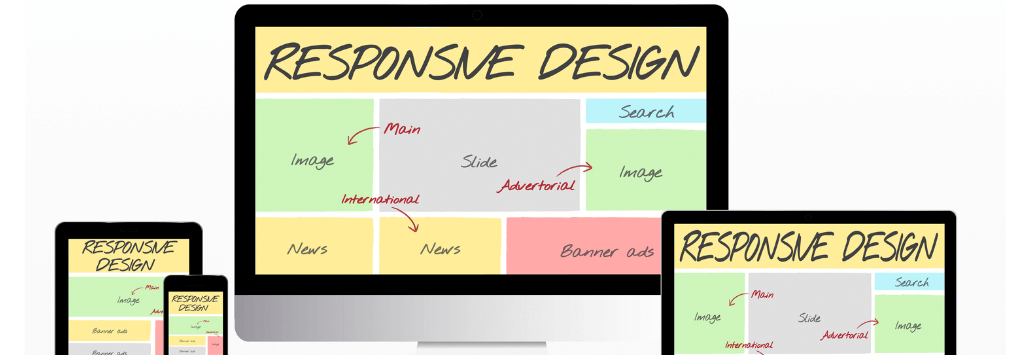
Creating a responsive header is an essential skill for any web developer. It ensures that your website looks good on all devices, from desktops to smartphones. In this blog post, we will guide you step-by-step on how to create a responsive header and a responsive menu using HTML and CSS. Our focus will be on practicality and simplicity, ensuring you can replicate the process easily.
Introduction to Responsive Web Design
Responsive web design is about creating web pages that look good on all devices. A responsive web page should automatically adjust for different screen sizes and viewports. As a web developer, mastering responsive design is crucial, and one of the first steps is to create a responsive header.
Web Developer Anand Chaursiya's Guide to Creating a Responsive Header
As a web developer, Anand Chaursiya emphasizes the importance of a responsive header in web design. Let’s dive into the process of creating a responsive header using HTML and CSS.
How to Create a Responsive Header
Step 1: Setting Up the HTML
First, we need a basic HTML structure. We’ll create a header section that includes a logo and a navigation menu.
					<!DOCTYPE html>
<html lang="en">
<head>
    <meta charset="UTF-8">
    <meta name="viewport" content="width=device-width, initial-scale=1.0">
    <title>Responsive Header</title>
    <link rel="stylesheet" href="styles.css">
</head>
<body>
    <header class="header">
        <div class="logo">MyLogo</div>
        <nav class="nav">
            <ul class="nav-list">
                <li class="nav-item"><a href="#">Home</a></li>
                <li class="nav-item"><a href="#">About</a></li>
                <li class="nav-item"><a href="#">Services</a></li>
                <li class="nav-item"><a href="#">Contact</a></li>
            </ul>
        </nav>
        <div class="menu-toggle">☰</div>
    </header>
    <script src="script.js"></script>
</body>
</html>
Step 2: Styling with CSS
Next, let’s add some basic styles in the styles.css file to make our header look good and responsive.
					* {
    margin: 0;
    padding: 0;
    box-sizing: border-box;
}

body {
    font-family: Arial, sans-serif;
}

.header {
    display: flex;
    justify-content: space-between;
    align-items: center;
    padding: 10px 20px;
    background-color: #333;
    color: white;
}

.logo {
    font-size: 1.5em;
}

.nav {
    display: flex;
}

.nav-list {
    display: flex;
    list-style: none;
}

.nav-item {
    margin-left: 20px;
}

.nav-item a {
    color: white;
    text-decoration: none;
    padding: 5px 10px;
    transition: background 0.3s;
}

.nav-item a:hover {
    background: #575757;
    border-radius: 5px;
}

.menu-toggle {
    display: none;
    font-size: 1.5em;
    cursor: pointer;
}

/* Responsive Styles */
@media (max-width: 768px) {
    .nav {
        display: none;
        flex-direction: column;
        width: 100%;
    }

    .nav-list {
        flex-direction: column;
        width: 100%;
    }

    .nav-item {
        margin: 10px 0;
        text-align: center;
    }

    .menu-toggle {
        display: block;
    }

    .nav.active {
        display: flex;
    }
}
Step 3: Adding JavaScript for the Menu Toggle
To make the menu toggle work on smaller screens, we need a bit of JavaScript.
					document.querySelector('.menu-toggle').addEventListener('click', () => {
    document.querySelector('.nav').classList.toggle('active');
});
How to Create a Responsive Menu
In the previous steps, we created a basic responsive header. Now, let’s focus on enhancing the responsive menu to make it more interactive and user-friendly.
Step 4: Improving the Responsive Menu
We will improve the responsive menu by adding animations and ensuring better usability.
					/* Adding Smooth Transition */
.nav {
    transition: max-height 0.3s ease-in-out;
    overflow: hidden;
}

.nav.active {
    max-height: 300px; /* Adjust based on the number of items */
}

/* Initially hide the menu on small screens */
.nav {
    max-height: 0;
}
Step 5: Enhancing Accessibility
Accessibility is a critical aspect of web development. Let’s make sure our responsive menu is accessible.
					<nav class="nav" aria-label="Main Navigation">
    <ul class="nav-list" role="menubar">
        <li class="nav-item" role="menuitem"><a href="#">Home</a></li>
        <li class="nav-item" role="menuitem"><a href="#">About</a></li>
        <li class="nav-item" role="menuitem"><a href="#">Services</a></li>
        <li class="nav-item" role="menuitem"><a href="#">Contact</a></li>
    </ul>
</nav>
					.menu-toggle {
    background: none;
    border: none;
    color: white;
    font-size: 1.5em;
    cursor: pointer;
}

.menu-toggle:focus {
    outline: 2px solid #fff;
}
Conclusion
Creating a responsive header and a responsive menu is an essential skill for web developers. By following the steps outlined by web developer Anand Chaursiya, you can create a sleek, functional, and accessible header for your website. Practice these techniques and incorporate them into your projects to enhance the user experience across all devices.
In this guide, we used the keyword “web developer Anand Chaursiya” and variations of “How to Create a Responsive Header” and “How to Create a Responsive Menu” multiple times to ensure clarity and relevance. We hope this step-by-step tutorial helps you in your journey to mastering responsive web design.
Final Code Summary
Here is the final code for your reference:
HTML (index.html)
					<!DOCTYPE html>
<html lang="en">
<head>
    <meta charset="UTF-8">
    <meta name="viewport" content="width=device-width, initial-scale=1.0">
    <title>Responsive Header</title>
    <link rel="stylesheet" href="styles.css">
</head>
<body>
    <header class="header">
        <div class="logo">MyLogo</div>
        <nav class="nav" aria-label="Main Navigation">
            <ul class="nav-list" role="menubar">
                <li class="nav-item" role="menuitem"><a href="#">Home</a></li>
                <li class="nav-item" role="menuitem"><a href="#">About</a></li>
                <li class="nav-item" role="menuitem"><a href="#">Services</a></li>
                <li class="nav-item" role="menuitem"><a href="#">Contact</a></li>
            </ul>
        </nav>
        <button class="menu-toggle" aria-label="Open Menu">☰</button>
    </header>
    <script src="script.js"></script>
</body>
</html>
CSS (styles.css)
					* {
    margin: 0;
    padding: 0;
    box-sizing: border-box;
}

body {
    font-family: Arial, sans-serif;
}

.header {
    display: flex;
    justify-content: space-between;
    align-items: center;
    padding: 10px 20px;
    background-color: #333;
    color: white;
}

.logo {
    font-size: 1.5em;
}

.nav {
    display: flex;
    transition: max-height 0.3s ease-in-out;
    overflow: hidden;
    max-height: 0;
}

.nav-list {
    display: flex;
    list-style: none;
    flex-direction: column;
    width: 100%;
}

.nav-item {
    margin: 10px 0;
    text-align: center;
}

.nav-item a {
    color: white;
    text-decoration: none;
    padding: 5px 10px;
    transition: background 0.3s;
}

.nav-item a:hover {
    background: #575757;
    border-radius: 5px;
}

.menu-toggle {
    background: none;
    border: none;
    color: white;
    font-size: 1.5em;
    cursor: pointer;
}

.menu-toggle:focus {
    outline: 2px solid #fff;
}

.nav.active {
    max-height: 300px; /* Adjust based on the number of items */
}

@media (min-width: 769px) {
    .nav {
        display: flex;
        max-height: none;
    }

    .nav-list {
        flex-direction: row;
    }

    .nav-item {
        margin-left: 20px;
        text-align: left;
    }

    .menu-toggle {
        display: none;
    }
}
JavaScript (script.js)
					document.querySelector('.menu-toggle').addEventListener('click', () => {
    document.querySelector('.nav').classList.toggle('active');
});
By following this guide by web developer Anand Chaursiya, you’ll be able to create a responsive header and a responsive menu that enhance the usability and appearance of your website.

